

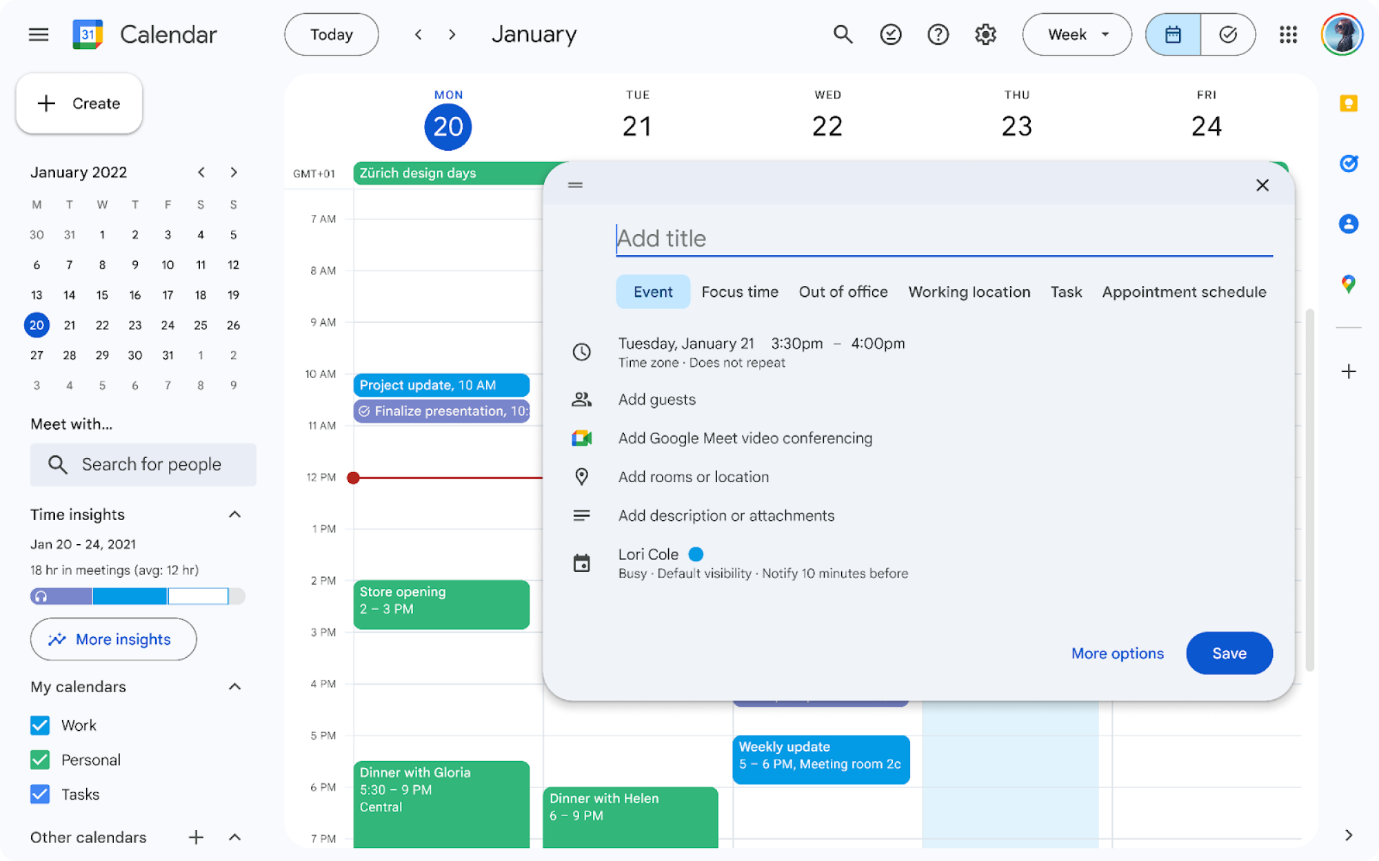
Google Calendar is getting a big design revamp, so it may look quite different on your web browser. Among the changes is the option to toggle to dark mode, which some users will certainly welcome.
Google published a blog detailing the changes, which began rolling out this week. Most of the changes are a part of the company’s shift to its Material Design 3 standards. You can expect different buttons, new fonts, and a focus on legibility.
Google wrote about changes were:
Controls (like buttons, dialogs, and sidebars) that are more modern and accessible
Interface typography that uses Google’s custom-designed and highly-legible typefaces
Iconography that is legible and crisp, with a fresh feel
Of course, there’s dark mode, which many people prefer for battery conservation and eye strain. The dark mode option is available in the settings icon at the top-right corner of your Google Calendar, under the “Appearance” tab.
Google gave a preview of what the new calendar and dark mode options will look like.

Credit: Google
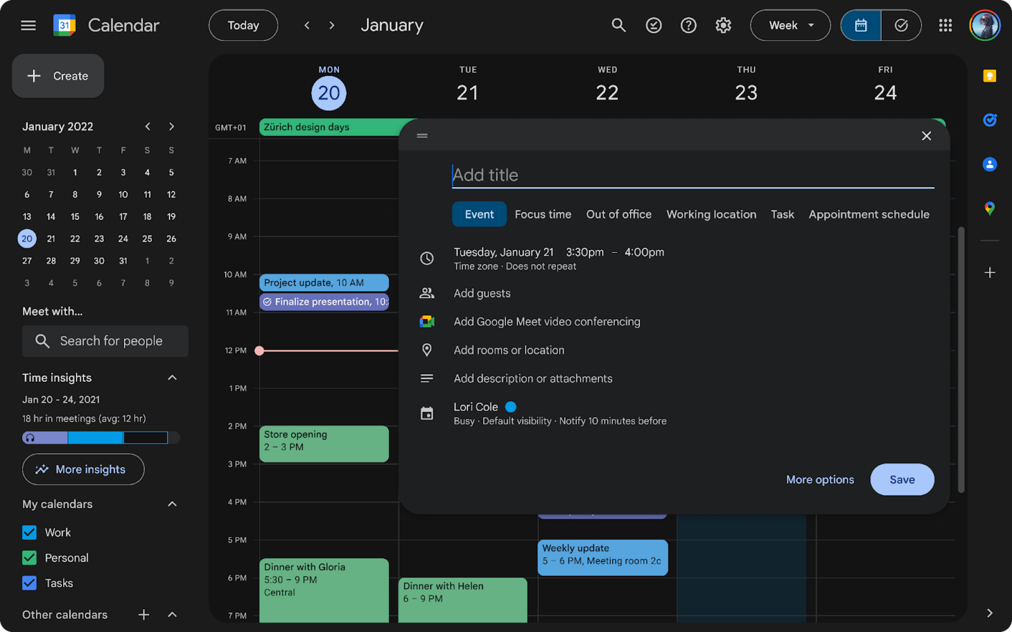
Credit: Google
While the changes to Google Calendar might not be the most dramatic shifts in history, it’s good to be ready for anything new in a tool you likely use daily.
https://mashable.com/article/google-calendar-redesign-dark-mode